

Showing posts with label charts and graphs. Show all posts
Showing posts with label charts and graphs. Show all posts
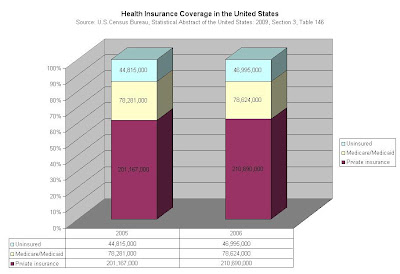
Monday, January 12, 2009
Wednesday, January 7, 2009
Tuesday, January 6, 2009
Interactive World Oil Map
A great map at the Financial Times that shows the major world players in the oil market, including flows of the stuff.
Sunday, January 4, 2009
Is Natural Gas Peaking in Europe?
The subject of "peaking" gets tiresome, but I want to track these types of analyses for future reference. The following graph is not my own, but is from The Oil Drum.


Saturday, January 3, 2009

Oil Found Versus Oil Consumed
I ran across the data that serve as the basis for the graph below in Kevin Phillips' latest book, Bad Money [Penguin, 2008, pp 16-17]. Phillips' own source for the data was an October 2006 interview of Charles Maxwell, an oil analyst, by Barron's. In addition to the graph, I found this interesting quote:

Q: Where are oil prices headed?
A: We are now getting a reaction to the higher oil prices. It is translating into slower economic growth and, of course, it is allied with a rise in interest rates. Don't think that it is just that rising oil prices equal lower economic growth. It is a question of rising oil prices and less liquidity and higher rates that's a triple threat. The bottom could be in the high 40s, though that wouldn't be sustainable. On a yearly average, we will stay in the 60s, but we'll spend a lot of time in the 50s. Then they'll start up again in 2008-2009 and go up for some time. When we get to 130 or 150 there will be another pullback.

Friday, January 2, 2009
Energy Return On Investment
Energy Return On Investment (EROI) is an important concept theoretically, but I haven't run across a lot of solid data that show the EROIs for various fossil fuels or how they have changed over time. I created the graph below based on data quoted in this post on the web site of The Oil Drum. If and when I come upon other data, I'll post them for review and comparison.
EROI expresses the amount of energy that is received for a unit of energy invested - the amount of "bang for the buck," so to speak. Obviously, the higher this ratio, the better. One of the unique characteristics of oil as a fuel is that this ratio has historically been quite high. It has apparently been declining, reflective of the fact that the energy costs of extracting the oil have been increasing. (This makes intuitive sense, since one would expect that the easy-to-get oil would be pumped before the harder-to-get oil and that over time, the harder-to-get stuff would make up a greater proportion of the remaining reserves.)
Clearly, if the ratio were to drop below 1, it would make no sense to get the oil, no matter how much of it remained.

Tuesday, December 30, 2008

Sunday, December 28, 2008
U.S. Oil Production
While working as a scientist at Shell Oil in 1956, M. King Hubbert predicted that oil production in the United States would reach a peak in 1970 and decline thereafter. The following graph shows that he was exactly right:*

*Hubbert did not take into account Alaska, which was not a source of production in 1956. As the line showing total production indicates, Alaskan oil was able to arrest the decline for a while, although not enough to permit the surpassing of the 1970 peak.
Hubbert later applied his methods to global oil production, predicting it would peak between 1995 and 2000. He was wrong. But was he wrong because his theory was wrong or was he wrong simply in the timing? The debate over "peak oil" rages, but the flatness of global production in recent years given overall economic growth makes one sit up and take notice. Here's a chart I posted earlier:

Where Our Oil Comes From
Here's another graph I've created from data from the Statistical Abstract of the United States, showing America's sources of imported crude oil.

Some notable observations:

Some notable observations:
- The nation that supplies us with the most oil is Canada.
- Mexico's contribution dropped significantly in 2007. We can expect this to continue in the future, since its Cantarell oil field (the 3rd largest in the world) peaked in 2004 and is experiencing sharp drops in output.
- Saudi Arabia's contribution has been flat in recent years, as has Nigeria's.
- The "Rest of OPEC" includes Algeria, Angola, Iraq, Kuwait, and Libya. Only Algeria has shown significant growth since 2005.
- The "Rest of non-OPEC" includes Brazil, Colombia, Ecuador, Russia, and the U.K. Only Brazil has had an increasing contribution. The U.K.'s provision of 37 million barrels in 2007 was 46% of what it was in 2005 and 25% of what it was in 2002.
Saturday, December 27, 2008
Fun With Statistics
The result of a snowed-in afternoon at the in-laws' with the Statistical Abstract of the United States.


Financial Egg Laying
I constructed the following charts from data provided by Niall Ferguson in his excellent piece in Vanity Fair, "Wall Street Lays Another Egg."


Sunday, December 21, 2008

Saturday, December 20, 2008
Annual Cycling Results
The much anticipated digest of my personal cycling statistics has been released for publication. Not one, but two cycling seasons are graphically displayed below, each data point representing the mileage logged on a given day. By popular demand, I am again showing annual trendlines, with fifth-order polynomials selected for the way they follow the data points diligently, but not slavishly, just like trusty dogs.

Total mileage for 2008 came in at 6776, down from 2007's epic 8123, but still respectable. I passed the century mark on six occasions, up from four the previous year, with a 133-mile trip to and from Bull Valley taking top honors (although still modest compared to the chart-busting 190-mile brevet of May 5, 2007).

Total mileage for 2008 came in at 6776, down from 2007's epic 8123, but still respectable. I passed the century mark on six occasions, up from four the previous year, with a 133-mile trip to and from Bull Valley taking top honors (although still modest compared to the chart-busting 190-mile brevet of May 5, 2007).
Wednesday, December 17, 2008
Peak Oil Watch
I created these graphs myself based on data published, respectively, by the Energy Information Administration and the BP Statistical Review.


Note that oil prices began their steep rise in 2003 and crossed the $40 per barrel threshold in May, 2004, early in their eventual climb to the frightening levels of the past summer. If we look at what was going on in oil production, we see that production increased noticeably in 2003 and 2004 and then was effectively flat from 2005 through 2007, a period of robust world economic growth. Why?


Note that oil prices began their steep rise in 2003 and crossed the $40 per barrel threshold in May, 2004, early in their eventual climb to the frightening levels of the past summer. If we look at what was going on in oil production, we see that production increased noticeably in 2003 and 2004 and then was effectively flat from 2005 through 2007, a period of robust world economic growth. Why?
Tuesday, December 16, 2008

Saturday, December 13, 2008
More Interesting Graphs From the Federal Reserve
If you're like me, you hear economic statistics every day that mean little unless they are placed in context. Here then, is some context:


.png)


.png)
TARP vs. Fed Lending
Is the financial system in even worse shape than we think? The Treasury has been authorized under TARP to spend $700 billion to do whatever it's doing (buying toxic assets? injecting capital? subsidizing AIG boondoggles and bonuses?), but getting lost in the shuffle is the fact that the Fed is also handing out an unprecedented amount of money. Take a look at this graph, which comes directly from the Federal Reserve Bank of St. Louis, and which shows the Total Borrowings of Depository Institutions from the Federal Reserve through November 1 of this year:

Thus far, the Fed has refused to reveal to whom these loans have gone and what it has accepted as collateral. Bloomberg News has filed a lawsuit against the Federal Reserve under the Freedom of Information Act to find out. According to Bloomberg, the loans now exceed $2 trillion.
From Bloomberg's latest article about this:
“If they told us what they held, we would know the potential losses that the government may take and that’s what they don’t want us to know,” said Carlos Mendez, a senior managing director at New York-based ICP Capital LLC, which oversees $22 billion in assets.
The Fed stepped into a rescue role that was the original purpose of the Treasury’s $700 billion Troubled Asset Relief Program. The central bank loans don’t have the oversight safeguards that Congress imposed upon the TARP.
Total Fed lending exceeded $2 trillion for the first time Nov. 6. It rose by 138 percent, or $1.23 trillion, in the 12 weeks since Sept. 14, when central bank governors relaxed collateral standards to accept securities that weren’t rated AAA.
Subscribe to:
Posts (Atom)